Salubris Iași, a city waste service website rebuilt around residents
An unofficial concept, made independently and prepared as a proposal for the company. It was not commissioned by Salubris S.A. The logo and the content belong to the company. The technical analysis relies only on information publicly visible in the pages of the site; I did not test or exploit anything.
- Project type
- Website (redesign concept)
- My role
- UX / UI Designer, with AI-assisted front-end implementation
Context & Problem
Salubris is the waste operator of Iași, Romania. On its website, a whole city looks up what to do with an old sofa, how much there is to pay and when the bins are collected.
The current site is organised around the company chart and runs on a page builder from 2016 that was never updated. I rethought it on my own initiative, as a resident of the city.
My Role
I did the whole project alone, in two days:
- UX and technical audit, from public information
- information architecture
- visual direction and design system
- content rewriting
- front-end in React, assisted by Claude Code
Why the UX did not work
The structure followed the company, not the person
The menu holds around 70 links, and the same entry appears in three places.
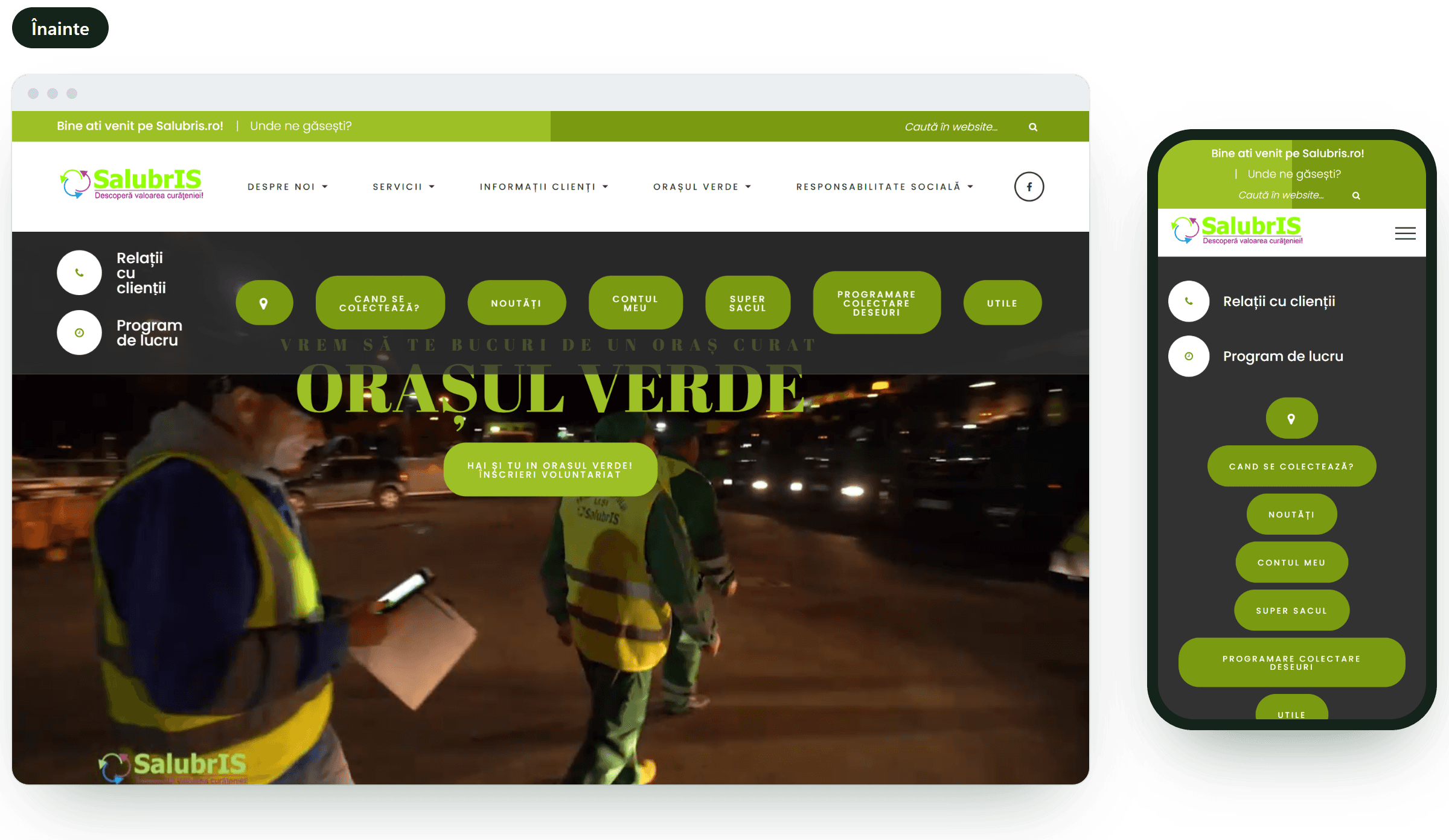
The first screen on a phone was empty
On mobile, the first screen is filled entirely by seven buttons, and every page opens with a loading indicator.
Collection day was hidden
It sits behind a banner, on a separate page, where you search three times to learn the day for every type of waste.
The content had to be decoded
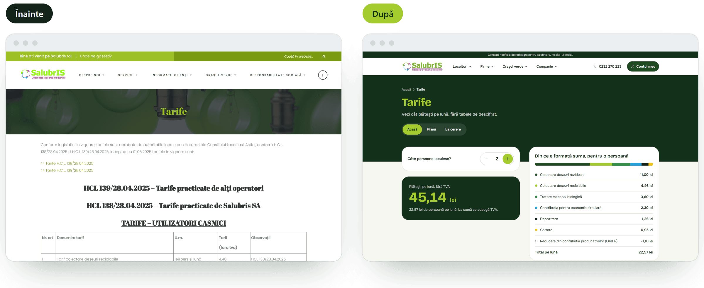
Tariffs are tables that point to council decisions, forms are a list of PDFs, and booking a pickup is a page with three links.
The audit in numbers
- around 70 links in the menu
- 7 buttons on the first mobile screen
- 3 searches for a single piece of information
- 7 of 8 images without alternative text
- 10 years since the page builder version
The risk behind the interface
The site runs on a page builder from 2016 and a forms plugin from 2019. Since then, security vulnerabilities were published and fixed for both, and the fixes only reach sites that update.
It matters because personal data passes through the site: the forms receive contact details, and the My account button leads to the invoice portal. Someone who can alter a page can change where that button goes.
The prototype is a static site, with no database and no plugins to keep up to date.
What I checked and what I did not
I only read what is publicly visible in the page source. I did not test any vulnerability and I do not know what protection the server has.
Constraints & Key Decisions
The logo stays
I kept the identity and only toned down the neon green of the logo.
Transparency moves, it does not disappear
The decisions, budgets and declarations required by law sit in one section, with search and a year filter.
Real data
The collection schedule for 883 streets and the tariffs approved by the Local Council are the real ones.
Straight to code
No mockups: two working versions of the first screen, then the rest in the same codebase. The site is marked as an unofficial concept and hidden from search engines.
Solution
- a menu in four areas: Residents, Businesses, The green city, Company
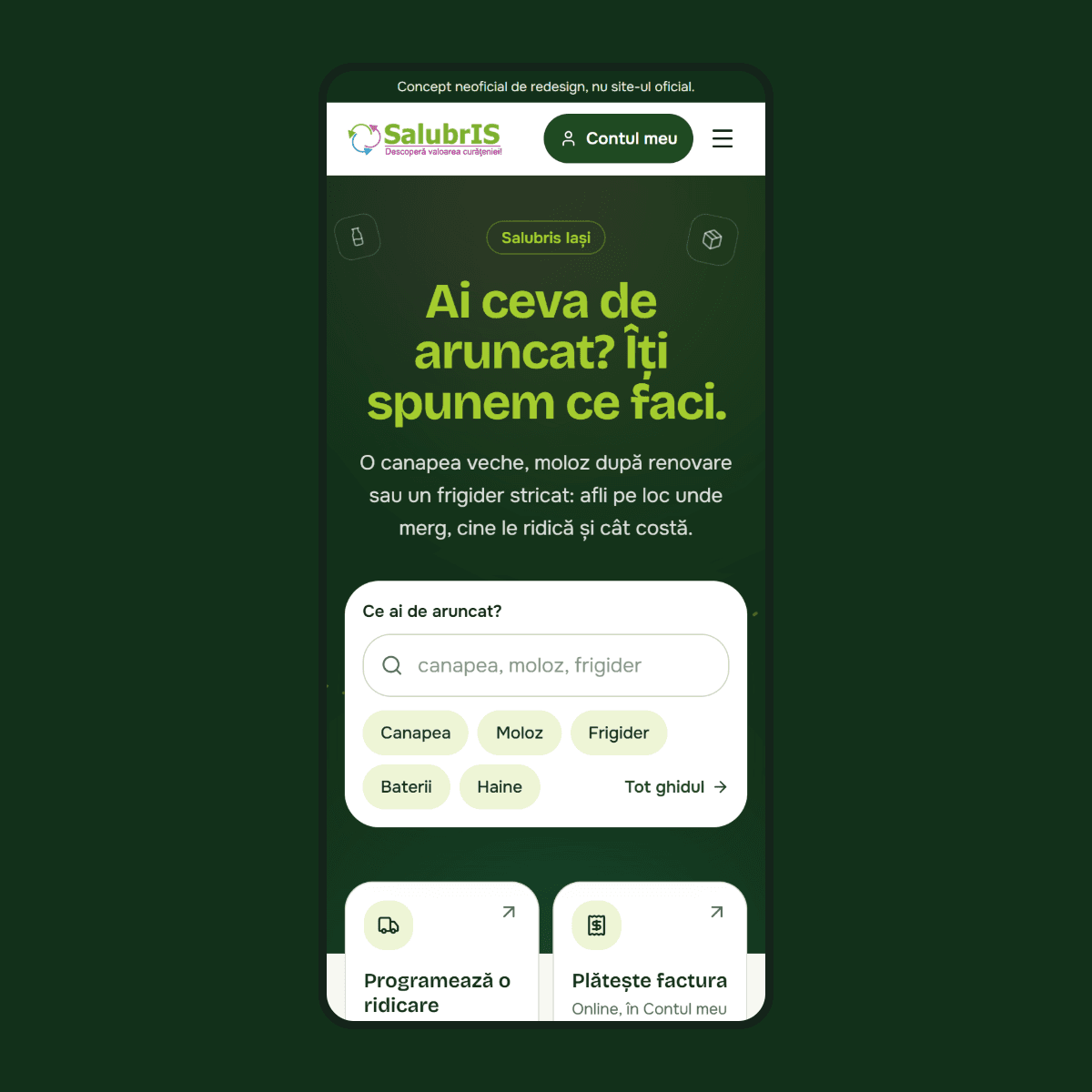
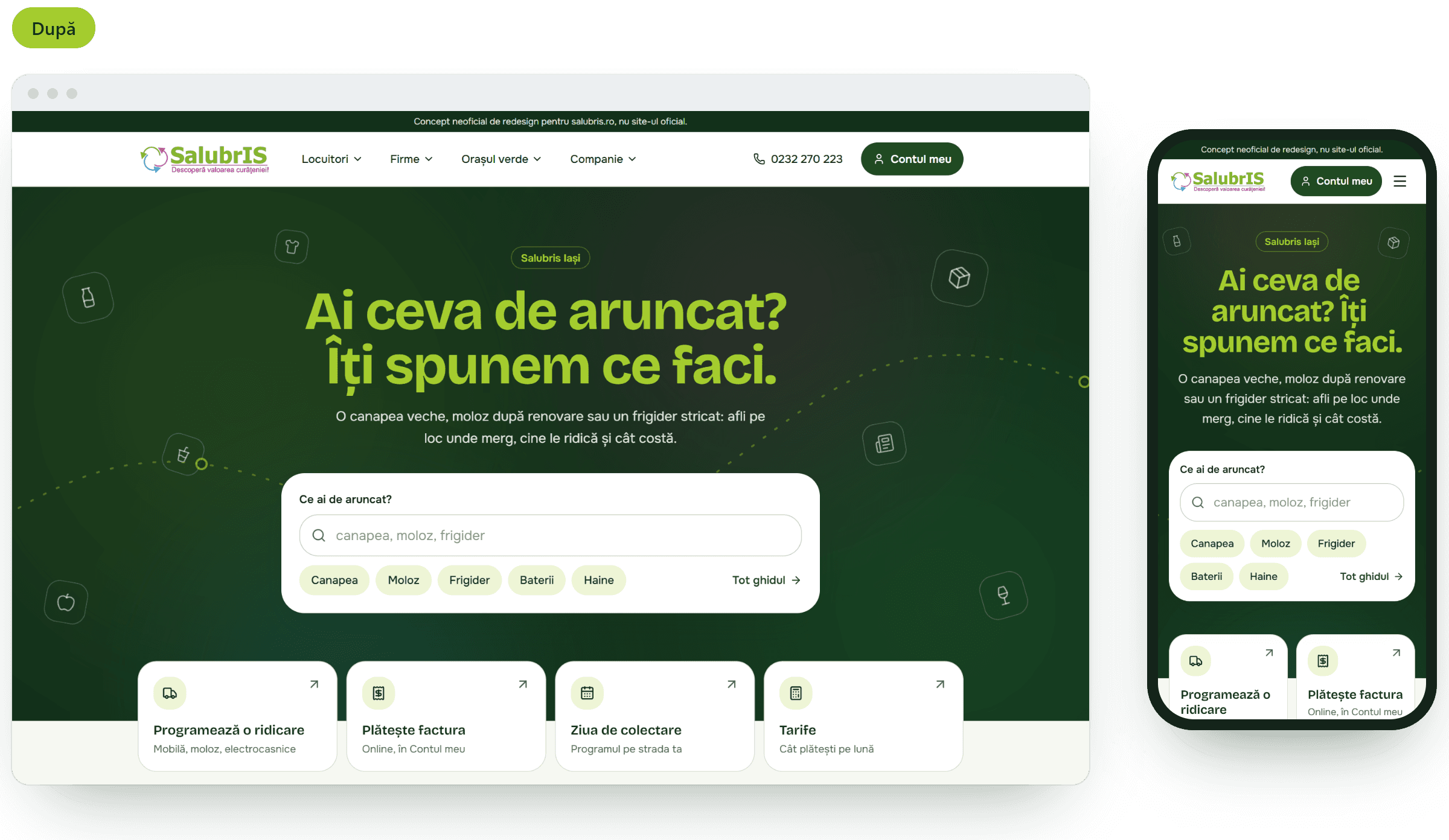
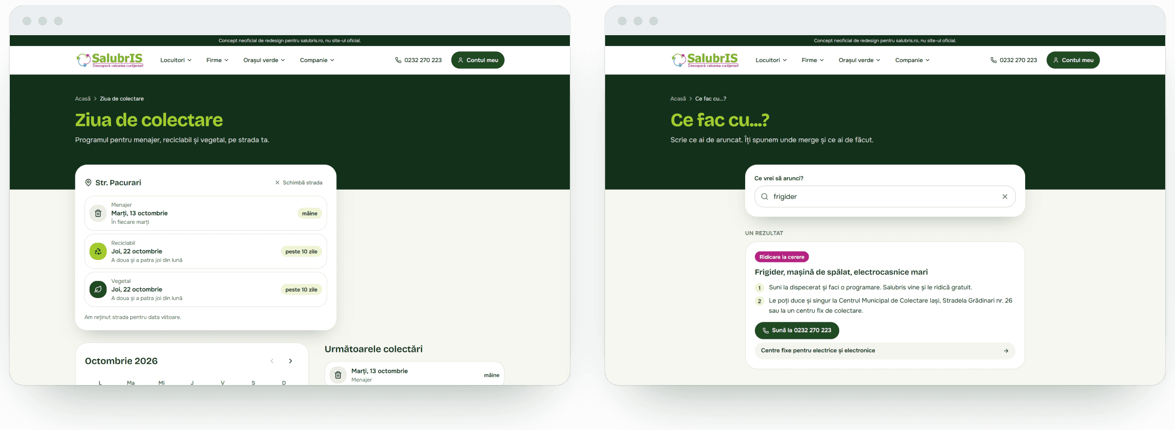
- a first screen that asks what you need to throw away and takes you straight to the answer
- collection day for your street, for every type of waste, with a monthly calendar
- booking a pickup in three steps, for furniture, rubble and appliances
- tariffs as a calculator
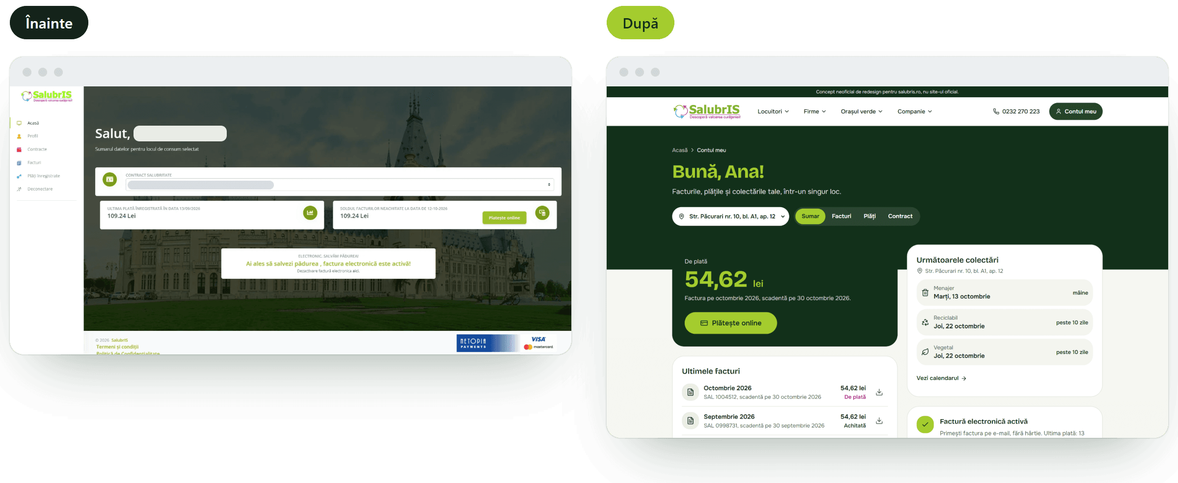
- the customer account, rethought as a demo page: placeholder data, no functionality built
- a clear hero with subtle animation, in place of the video on the current site
Results
- A working, published prototype with seven key pages, on desktop and mobile
- Collection day: from a separate page and three repeated searches to a single field on the home page
- Menu reduced from roughly 70 links to four areas
- Real schedule for 883 streets and real tariffs, with a calculator
- No plugins and no database in the public part of the site
- The concept has not yet been tested with users and has no usage figures. That is the next step.
Key Learnings
- A UX audit of a public service quickly shows the gap between what the institution wants to say and what people come to find out.
- Real data changes design decisions. Unevenly written street names and the months when garden waste is not collected only showed up once I worked with the actual schedule.
- Security is part of the user experience. Someone who leaves their address in a form trusts that the site is looked after, even if they cannot see it.
- With AI, a single designer can ship in two days a prototype that used to take a team. The hard part stays the same: deciding what matters on the first screen.
Interested in working together?
If you’d like to discuss a similar problem or explore a collaboration, feel free to reach out.