A mobile app for managing air quality control devices
- Project type
- Mobile application
- My role
- UX / UI Designer
Context & Problem
Aeros is a mobile application that gives people visibility and control over their indoor climate. Paired with a dedicated sensor, the app measures key environmental parameters such as temperature, humidity, TVOC, CO₂, and particulate matter, helping users better understand and improve their living and working environments.
The sensor is precise, capable of detecting even aerosols. As the product matured and the user base grew, the existing mobile application no longer reflected the quality of the hardware or the expectations of its users.
The initial version of the app was built directly by developers using UI libraries, without design involvement.
The project focused on a major redesign, fully rethinking the mobile experience for a mixed user base.
My Role & Responsibilities
I was responsible for the complete redesign of the mobile application, including:
- UX improvements and flow refinement
- device onboarding redesign
- information hierarchy and screen structure
- UI consistency and visual system improvements
- high-fidelity UI design and prototyping
The redesign was fully delivered for Android. iOS implementation was planned to follow, based on the same design direction.
Constraints & Key Decisions
Redesigning an active product
The application already had users in production. The redesign needed to significantly improve usability and visual quality while remaining compatible with existing usage patterns.
Improving readability and interaction
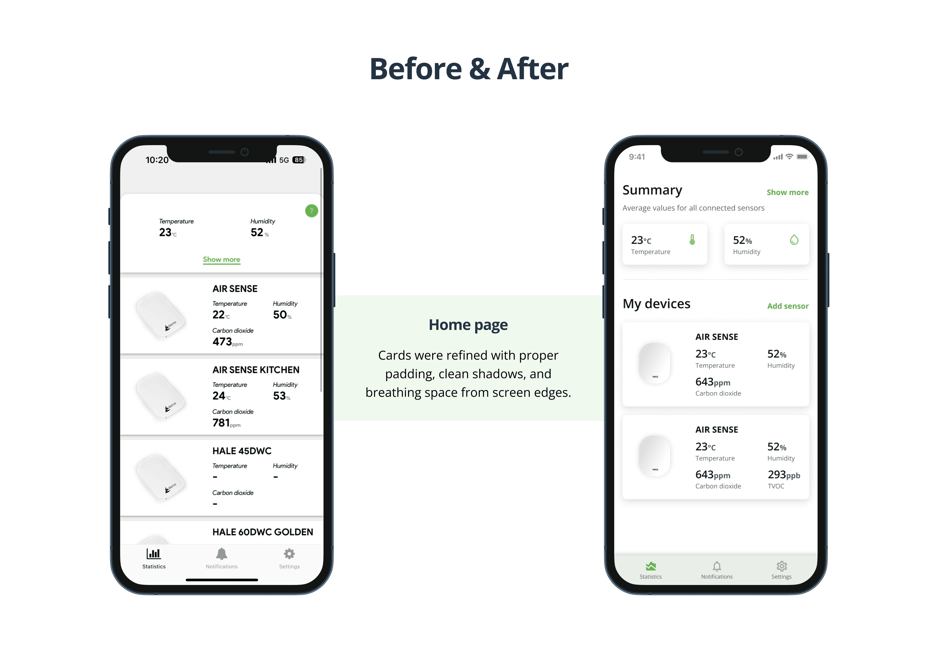
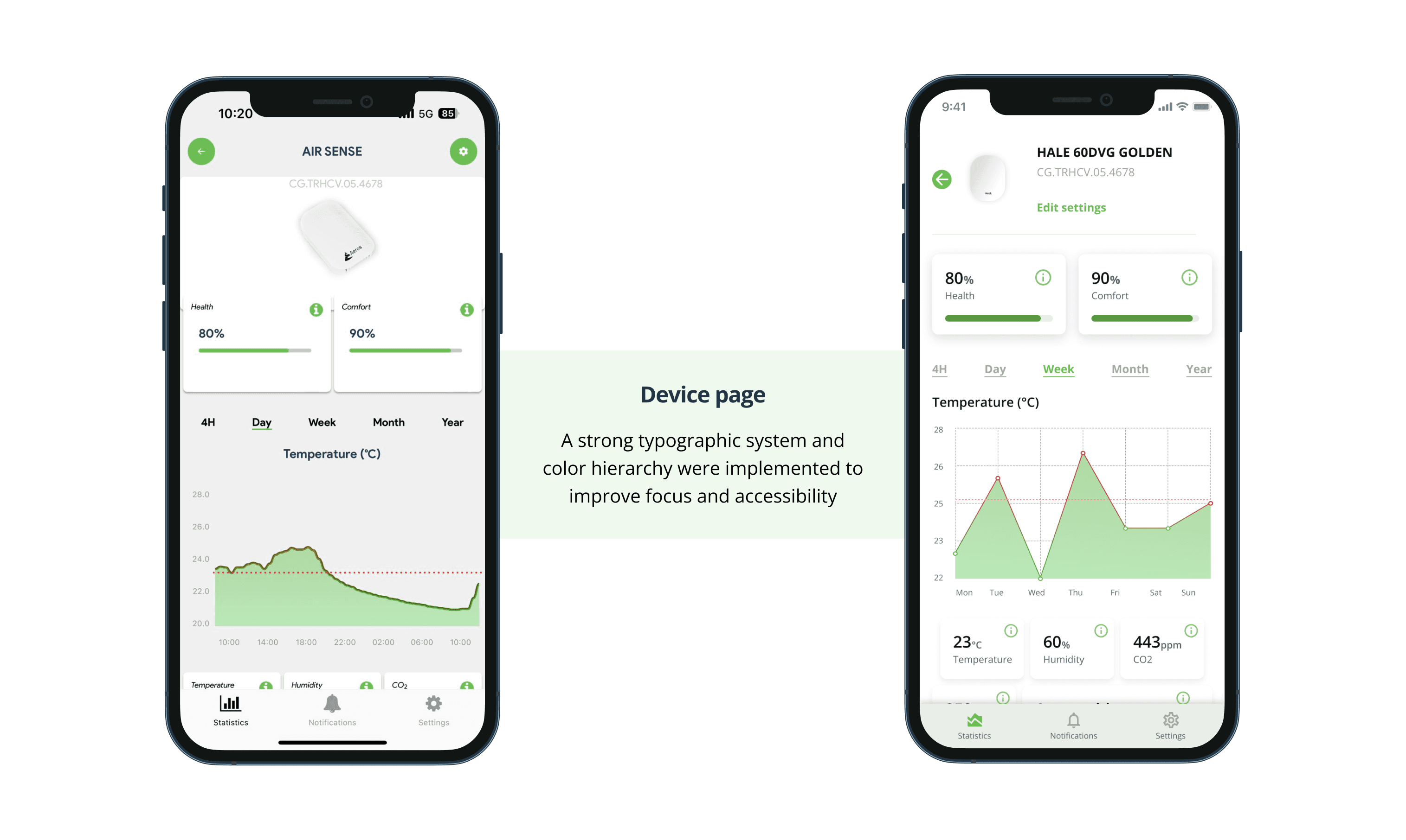
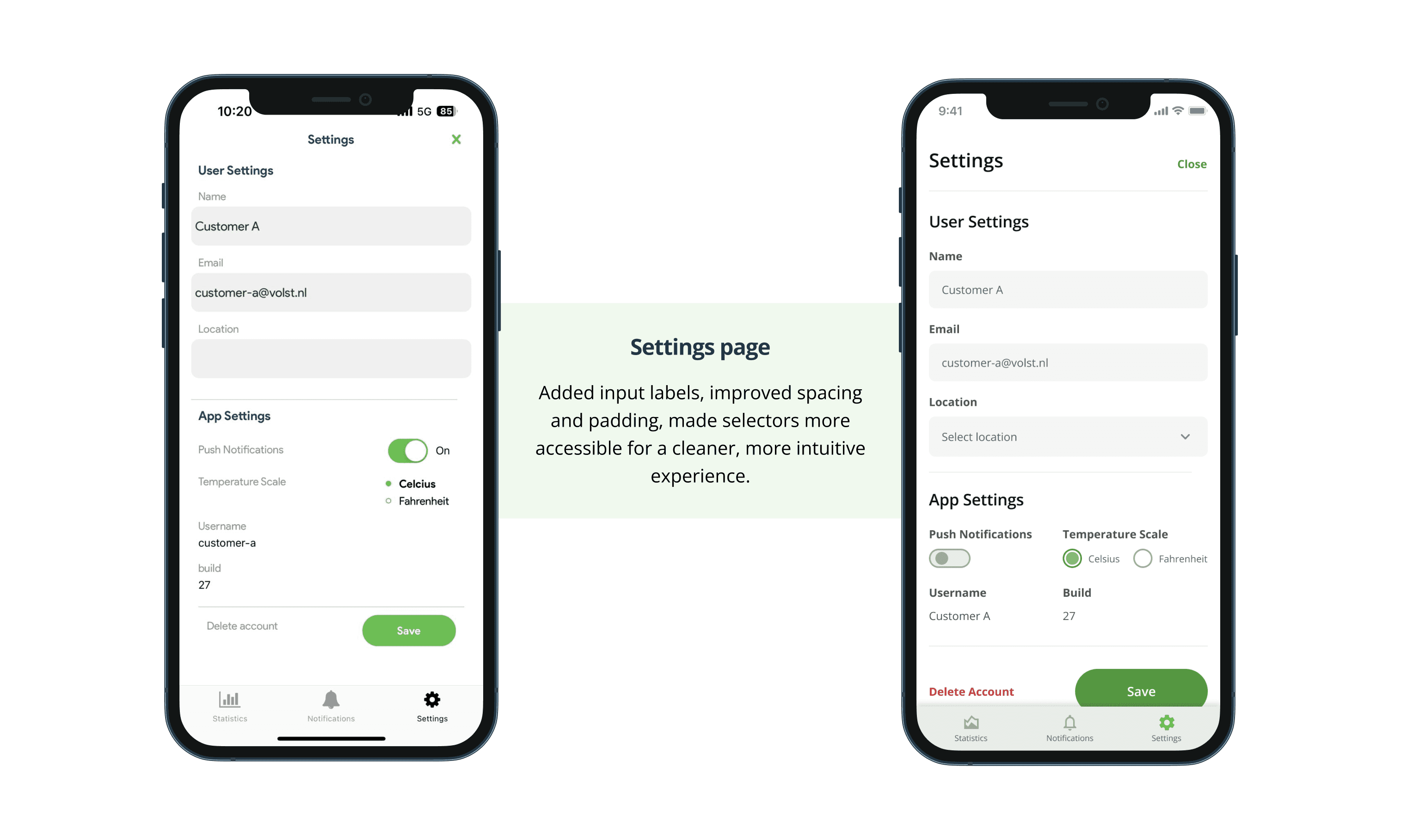
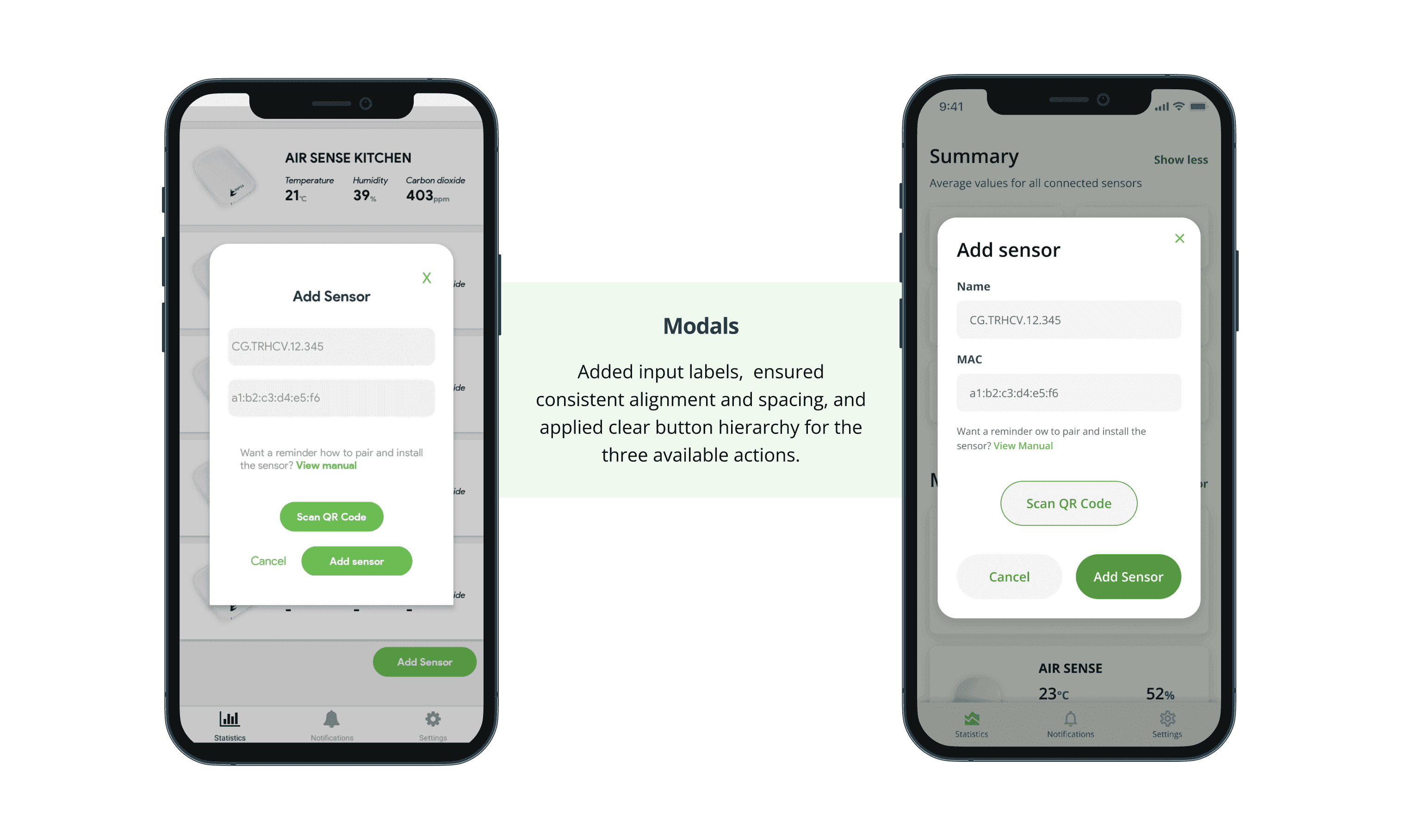
Small UI elements and limited hierarchy made the interface harder to use. The redesign focused on clearer visual structure, improved spacing, and more legible UI components.
Onboarding as a key UX moment
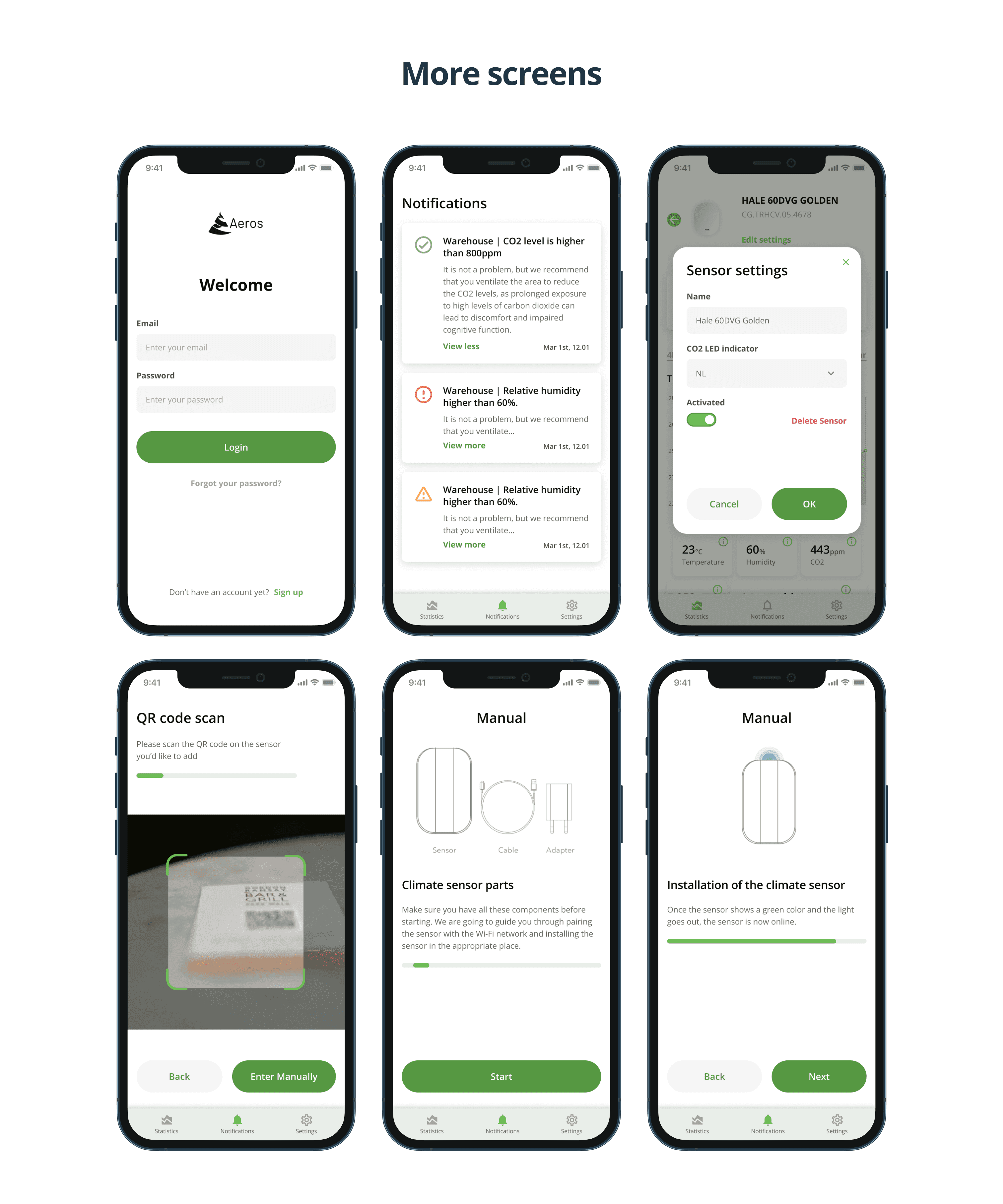
Device onboarding was identified as a critical friction point. In addition to manual setup, automatic device pairing via Bluetooth was introduced to simplify the initial experience.
Design–development alignment
Not every design decision made it to production exactly as intended, which is a familiar reality in cross-functional teams.
Solution
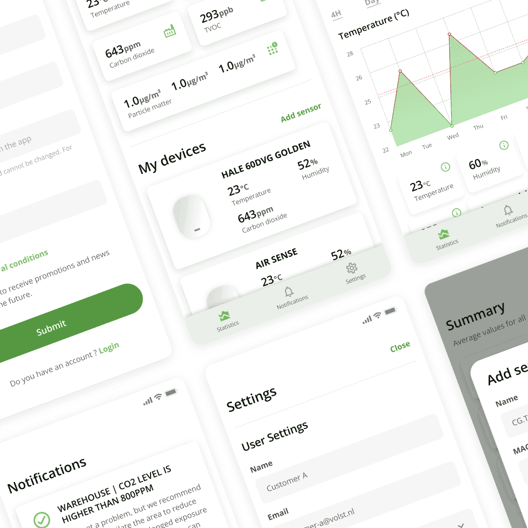
The application was redesigned with a more consistent, modern, and readable UI, aligned with the quality and precision of the Aeros hardware.
Core screens such as Home, Devices, and environmental insights were refined to improve clarity and day-to-day usability. Visual hierarchy was strengthened to help users quickly understand sensor data and indoor conditions.
The device onboarding flow was reworked to support automatic Bluetooth pairing, reducing setup friction while keeping manual configuration available when needed.
The overall UI direction aimed to provide a fresher and more pleasant visual experience, suitable for long-term use by both residential and professional users.
Results
- A complete Android redesign, delivered and shipped to production
- A consistent visual system applied across Home, Devices and the environmental insight screens
- A reworked device onboarding flow with automatic Bluetooth pairing, keeping manual setup as a fallback
- Larger, more legible components and a strengthened visual hierarchy across core screens
- iOS was not implemented during the engagement
This is what I delivered. I had no access to product analytics afterwards, so I make no claims about measured impact.
What I Learned
- Visual consistency has a direct impact on perceived product quality
- An interface built without a designer gains a lot from a design-led pass
- Onboarding flows play a critical role in user satisfaction
- Close collaboration between design and development is essential to preserve design intent
Interested in working together?
If you’d like to discuss a similar problem or explore a collaboration, feel free to reach out.